Responsive Web Design in Lafayette, LA
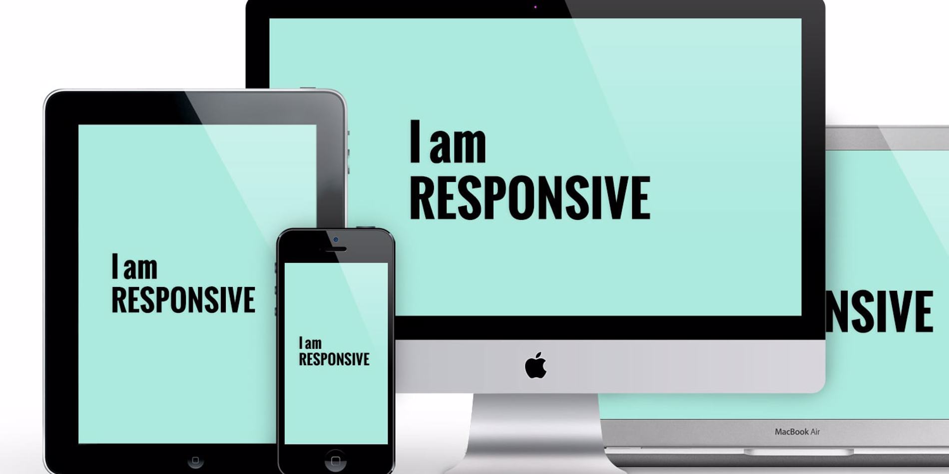
Responsive Web Design in Lafayette, LA
Responsive web design is a website’s ability to adapt to the device it is being viewed on. Without this type of web design, web designers in Lafayette, LA would be busy building new websites for every new device that comes out. Since new devices are always right around the corner, the constant building and rebuilding of one specific website would be time-consuming and costly.
Responsive web design utilizes flexible grids based on percentages rather than stagnant pixels or points. While on a desktop or laptop, a website can be viewed in its entirety. On a mobile device, like a cell phone or tablet, the website condenses information to allow easy accessibility. Since most people browse phones or tablets in a vertical position, changing the layout of the website is crucial to its user-friendliness. Typically, at the top of the page is a simple drop-down menu to the right or left of the logo. Continue scrolling and you will find the rest of the information available on the website like the address, phone number, about us section, etc.
Hiring a business that understands the needs of consumers visiting a client website, as well as the client's needs, will be able to implement a website that meets the client’s expectations and consumers’ needs. Search engines like Google understand the importance of mobile accessibility and rewards websites that utilize responsive web design in Lafayette, LA. Mobile web searching makes up a majority of internet searches these days, so sticking to a desktop web design will be detrimental to your business. You will miss out on all the benefits of investing in a website with mobile accessibility.